From the US Department of Agriculture’s Economic Research Service:
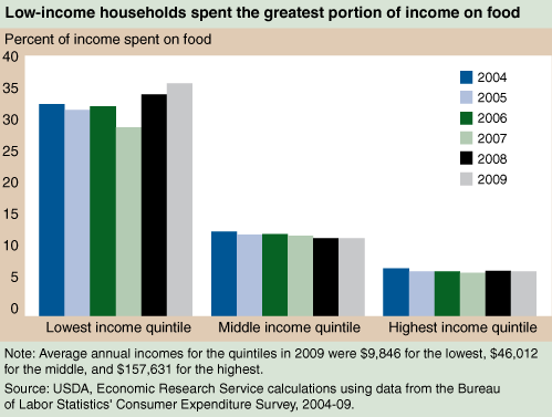
In 2006, households in the lowest income quintile spent 32.0 percent of their income on food. The 2007-09 recession led to increases in this already high share. Food spending as a share of income for households in the lowest income quintile grew to 35.6 percent in 2009—putting further pressure on thin budgets. Over the same period, food spending as a share of income declined for middle-income households from 12.5 to 11.9 percent and remained flat for the highest income quintile at 6.8 percent.
More here.
A colleague once submitted a paper for publication in which he did a considerable amount of empirical work to show that the quantity demanded of a good he was studying decreased as the price of the same good increased. The referee reports came back, and one of the referees sarcastically noted: “I guess it is always reassuring to discover that demand curves are still downward sloping…”
I guess it is reassuring to note that the cross-sectional version of Engel’s Law — the amount of income spent on food increases as income rises, but the proportion of income spent on food falls as income rises — still holds in the US?


Humanitarian Aid for Rape Victims
An editorial in the New York Times last week:
On his third day in office, President Obama issued an executive order lifting the odious “global gag rule” that denied federal money for family planning work abroad to any group that performed abortions or counseled about the procedure, even with its own money. But he left standing another policy that imposes similar speech restrictions and bans using foreign aid money for abortions — even to save a woman’s life or in cases of rape in war zones like Congo, Sudan and Burma.