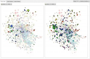
Here is a picture of the Indian economy between 1962 and 2009 (click on the picture for a bigger view):
The picture helps visualizing Indian economic development over the past 50 years.The turquoise dots that emerge in the lower right-hand corner between 1962 and 2009 represent the emergence of India’s high-tech industry. Likewise, the purple dots that emerge in the middle of the lower half between 1962 and 2009 represent the emergence of India’s chemicals industry.
The picture above was generated with an application over at the MIT Media Lab’s Economic Complexity Observatory. I discovered the app when reading the short article by Tim Harford in this weekend’s New York Times Magazine:
“Thanks to César A. Hidalgo of the MIT Media Lab, we can now visualize the differences between national economies in new ways. Hidalgo is a statistical physicist fascinated by the structure of networks, and along with the Harvard economist Ricardo Hausmann, he has been developing tools designed to study not just economic wealth but also economic structure and sophistication. (…)
Economies that export many types of products are more likely to be sophisticated; products exported only by sophisticated economies are more likely to be complex. Sophistication and wealth do not always go hand in hand. China and India are more complex than their incomes would suggest; Libya’s economy is richer than you would expect but also simpler. When economies are relatively sophisticated but relatively poor, they often have the potential for quick growth, as we have seen in China and India.”
