Last updated on October 30, 2011
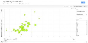
Taking a page from Hans Rosling, Tufts School of Nutrition associate professor Parke Wilde and his coauthors have developed a fascinating Google Gadget to help visualize the evolution of the Supplemental Nutrition Assistance Program (SNAP), i.e., of the food stamp program. Parke’s post on the topic is here.
The SNAP is one of the US government’s most important programs aimed at helping the poor (and, for those of us who teach principles of microeconomics, it also provides a great in-class example when teaching about budget constraints.)
 The gadget developed by Parke and his coauthors allows one to track either the number of SNAP participants or the proportion of SNAP participants as a percentage of the population against other indicators — population or unemployment rate — for all 50 states plus the District of Columbia over the last 20 years.
For example, looking at North Carolina where I live, I see that the state went from a proportion of food stamp users of 6.3 percent for an unemployment rate of 3.8 percent in 1990 to a proportion of food stamp users of 14.1 percent for an unemployment rate of 10.9 percent. It is particularly disturbing, however, to watch the proportion of SNAP participants explode after 2008 all over the country.