Skip to content

Category: Poverty

Spent

I’ve been unemployed for just one month, and already I’ve sent my only child to school crying because other kids make fun of him for being on the free lunch program, driven away from a fender bender with a parked car because I didn’t have the money to pay for the accident (luckily no one was around), been fired from my temp job for talking to a union organizer, put my kid’s dog to sleep because we couldn’t afford its medical care, and applied for food stamps — which won’t arrive until next month.

I’m not proud of myself, but this is what it takes to survive as a poor person in America — and now I know, because I played the game Spent, designed by Jenny Nicholson, herself once a child who grew up in poverty.

This is Christopher Mims discussing the game interactive presentation Spent in a post over at Technology Review. You can play Spent for free by clicking here. You might even be surprised at the very difficult choices poor Americans have to make every month.

The game is sponsored by the Urban Ministries of Durham, which provide food, clothing, and shelter to Durhamites in need.

(HT: Raul Pacheco-Vega.)
Where Do the Poor Live?

That’s the title of a new paper in World Development by Andy Sumner, a research fellow at the Institute of Development Studies (IDS) at Sussex. Here is the abstract:

This paper argues that the distribution of global poverty has changed and that most of the world’s poor no longer live in countries officially classified as low-income countries (LICs). It is estimated that the majority of the world’s poor, or up to a billion people, live in middle-income countries (MICs). This pattern is largely as a result of the recent graduation into the MIC category of a number of populous countries. The paper discusses the trends in the distribution of global poverty, and opens a wider discussion on the potential implications for aid and development cooperation.

This new paper looks like it is the published version of a Center for Global Development working paper published in October 2010 titled “The New Bottom Billion,” which is a play on the title of Paul Collier’s book The Bottom Billion.

To listen to an IDS podcast featuring both Andy Sumner and Paul Collier, who disagrees with Andy’s conclusion, click here. To follow Andy on Twitter, click here.

The Food Stamp Explosion

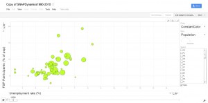
Taking a page from Hans Rosling, Tufts School of Nutrition associate professor Parke Wilde and his coauthors have developed a fascinating Google Gadget to help visualize the evolution of the Supplemental Nutrition Assistance Program (SNAP), i.e., of the food stamp program. Parke’s post on the topic is here.

The SNAP is one of the US government’s most important programs aimed at helping the poor (and, for those of us who teach principles of microeconomics, it also provides a great in-class example when teaching about budget constraints.)

The gadget developed by Parke and his coauthors allows one to track either the number of SNAP participants or the proportion of SNAP participants as a percentage of the population against other indicators — population or unemployment rate — for all 50 states plus the District of Columbia over the last 20 years.

For example, looking at North Carolina where I live, I see that the state went from a proportion of food stamp users of 6.3 percent for an unemployment rate of 3.8 percent in 1990 to a proportion of food stamp users of 14.1 percent for an unemployment rate of 10.9 percent. It is particularly disturbing, however, to watch the proportion of SNAP participants explode after 2008 all over the country.